What colors will be popular in the 2022 Spring Summer ? and in Autumn Winter 2023 ?
All the trends in furniture and interior design, for every room of your home.
It was the year 2000 when Pantone© named the first “Color of the Year”, indicating the shade that, according to the company, would become trendy in the following year. Since then the color classification’s company has created a tradition and the company has become a true point of reference in the field: a true “color authority”.
This year (2021), two colors won ex-equo: gray (Ultimate Gray 17-5104) and yellow (Illuminating 13-0647).
Table of contents
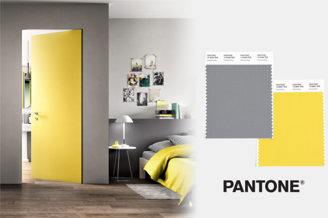
Concrete and steadfast, yet warm and optimistic, this color scheme conveys to us a sense of resilience and hope. We need to feel encouraged and uplifted; it’s something essential to the human mind,” commented Leatrice Eiseman, Executive Director of the Pantone© Color Institute, on the selection of Ultimate Gray and Illuminating for 2021.
A few months after the announcement (December ’21), we at Astra Vernici also feel like proposing colors and shades, which according to many experts could become popular in the coming year.
Our 2021 palette was full of proposals all however characterized by a hymn to rebirth, strength and energy. An injection of hope and optimism as a response to the dark period in history that we are experiencing.
In our opinion, the trend of the color of 2022 should direct attention to environmental issues, a theme that has never been felt in these times, focusing more on sustainability.
In fact, compared to the uncertainty and mistrust of this time, marked by the pandemic, natural colors express sobriety and tenacity and the ability to adapt that belong to nature, which is capable of rebirth and bloom after “cold and harsh winters”.
These colors evoke in the imagination a feeling of peace, well-being and health, overcoming the uncertainty and fear caused by this delicate and, in many ways, frightening period.
A message of hope, security and resilience as relevant as ever.
Among the colors defined as trendy and suggested by Pantone© for spring/summer 2022, we at ASTRA VERNICI propose some sober colors that are present in nature as pastel colors.
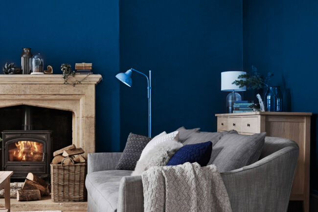
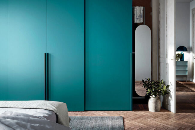
The timeless Blue: PANTONE® 19-4151 TCX Skydiver
Blue is usually a color that never goes out of style, ideal for those looking for classic and refined furniture. The color brings together confidence and calmness, the need to bring a sense of serenity back into our homes, but also a depth that tends towards introspection.
In 2022 it could still be one of the leading chromatic lines, this time in combination with antiqued gold to be sought in decor such as frames, furnishings and metal finishes of furniture.
Excellent for bedrooms, rooms where relaxation and serenity are sought after, it will also be suitable for living rooms and bathrooms.

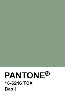
Basil Color: PANTONE® 16-6216 TCX Basil
This is a soft gray-green. After years of bold jewel tones, Pantone© is back on the midtones.
It’s a sophisticated color for spaces that crave a subtle yet breathtaking statement shade. Basil inspires us to start over and is a great choice for modern interiors and exteriors, giving the freshness and neutrality that is always needed in living spaces.
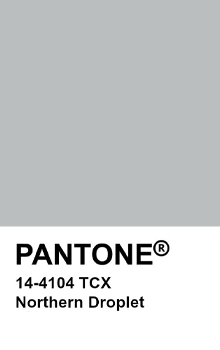
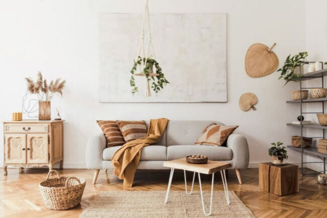
PANTONE® 14-4104 TCX Northern Droplet
This light gray Northern Droplet shade instills feelings of tranquility. It’s reminiscent of the sky on the grayest days in Northern Europe, which cause families and individuals to prefer enclosed spaces where they can find shelter. This connection to the nature of the sky and the “human” interior provides a feeling of quiet. A color that welcomes a sense of restoration and healing.
Northern Droplet offers snappy contrast and a clean look that is perfect for an entryway or a minimal kitchen or living room. When paired with warm, soft tones, such as natural wood, it takes on a soothing, calm vibe that is perfect for bedrooms, bathrooms or living areas where relaxation is the goal. It can be defined as a breezy, urban atmosphere color that blends beautifully with contemporary designs.

The Sky in the Room: PANTONE® 12-4401 TCX Spun Sugar
Awaken from quarantine with a renewed sense of admiration for nature, starting with the sky.
Like other blue hues, it promotes well-being, serenity and rest. It consists of a range of blues, which speaks to this sense of renewal.
Although it makes one think of nature, the name refers to cotton candy. A youthful, childlike element. Almost puerile, which contrasts with the seriousness and rigor that so many have had to go through in recent years. Starting with blue tones, it gives serenity and peace, perhaps facing a gloom, probably due to human adversity, as was the Covid-19 pandemic.
Creatives will be able to go wild with both color and form, to satisfy a customer who desires joy and tranquility: with a color that gives maximum expression to the will to live.


Minimal: PANTONE® 11-0602 TCX Snow White
Among the colors that will still be in vogue are all the shades tending towards white, as well as white itself. At Astra Vernici, we don’t want to underestimate these neutral, minimal colors. According to some people they are not even considered colors, for many others they are now a guarantee of elegance and simplicity. These tones bring space and a sense of purity to the home.
For people looking for a neutral tone that is simple yet elegant and refined, PANTONE© has developed Snow White, the minimal white likely to be on trend in the coming year.
In the West we have always had little respect for emptiness, always looking at the full, the gain, the material, what’s there. Often, however, we can understand something or someone above all thanks to what they are not. Our eye is in search of harmony between emptiness and form, between absence and presence, to achieve balance and maximum aesthetic contemplation. The concept came from the East, the taijitu is in fact a famous symbol of Chinese culture and in particular of the Taoist religion and Confucian philosophy. The idea that harmony is achieved with the balance between emptiness and form, with the concepts of Yin and Yang. The sun and the moon, the earth and the sky, black and white, cold and heat, and so on.
Different philosophies have then spread and one of these, popular in recent years is that of minimalism. It’s a comeback to classic marble. A return to keeping only the essentials, avoiding filling our lives, and therefore also our homes with unnecessary things. This color is associated with minimalism because we often choose neutral colors such as this Snow White by PANTONE©. This philosophy has made its way especially into urban furnishings in cities, as it is able to bring brightness and space even in the smallest and narrowest apartments.

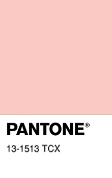
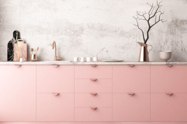
PANTONE® 13-1513 TCX Gossamer Pink
This is a strongly emotional color, which stimulates the right side of the brain, that of feelings. It conveys affection, love and protection, giving us soft and deep feelings. It takes us away from loneliness and transforms us into sensitive people.
It is a symbol of life, which so much has been taken away in these years. A fresh, clean, reborn life.
Gossamer pink is a color derived from the power of red but restrained by the purity of white. It indicates romance, beauty, sweetness, femininity, sophistication, tenderness. It is one of the colors that prevails in the trends of 2022 as a response to a feeling of loss and uncertainty experienced in 2020 and 2021: it comes to symbolize the motherhood of those who accompany you on a path of recovery.
It will not only be this type of pink, but pink in all its shades.
Articulated along a spectrum of warm tones, the color blends well with beige, gray, taupe and brown furnishings. The perception generated by their use in interior decoration is luxury and sophistication, an art-deco touch combined with the postmodernism typical of the 80s.
Fall 2022/2023, what will be the possible trends and the most used colors?
However, for fall/winter 2022/2023, in addition to the colors in natural tones, ranging from white to gray to almond and silver, evoking a world attentive to environmental issues and simplicity, which is not necessarily “flat”, in our opinion, there will also be the colors of passion, those of super-brilliant paints.
There will be many shades of green, to invoke a more “organic” agriculture that is attentive to CO2 emissions, but also marine waters and vitamins; the yellow of corn or gold will make a comeback.
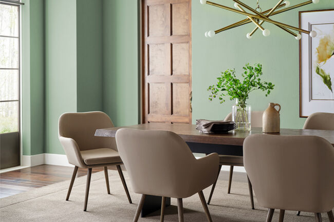
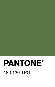
Green: PANTONE® 18-0130 TPG Cactus
Green is the color of nature, which envelops and soothes, giving brightness, freshness and harmony.
Considered a neutral color, neither warm nor cold, it can be declined and therefore chosen in its various shades.
It is said that it is the color of which we can see the highest number of shades.
The Cactus shade is enveloping and organic.
Suitable for living areas, it finds its place in modern furniture, especially in the minimalist style where it can be used in combination with black for eye-catching and bold contrasts.
The name Cactus does not immediately bring us back to nature, as a PANTONE® Forest Biome would have done, but to the desert. To an impervious and difficult environment.
Despite the fact that it may seem like a somber color, the cold seasons of 2022-2023 may find this, along with other greens, to be the star of the period.
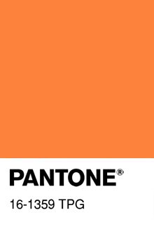
Orange: PANTONE® 16-1359 TPG Orange Peel
This is a vibrant and strong orange. After the spring season on pastel tones, with calm and posed tones, we find an orange shade. Given its strong charge of energy, it represents a choice of vitality when painting the walls of the house.
It is indicated in studios and offices, as well as other warm colors, as it is thought to stimulate creativity.
Interesting to use as a focal point in a home or office that holds more neutral and less saturated colors, such as grays. (see photo)
Unlike what the name might suggest, compared to a food environment it is probably better suited for living spaces or studies.
A shade that gives us back vigor, energy, while inspiring a nostalgic youth. A shade that creates the present and gives us confidence.
More generally, it symbolizes creativity, harmony but also expansion and ambition. From a physical point of view, orange is connected to primary instincts such as hunger, sexual energy and the movement of voluntary muscles, the ones we control.

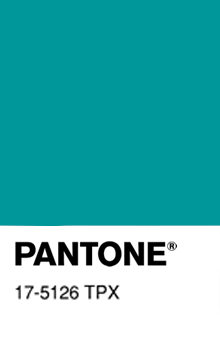
Viridian Green: PANTONE® 17-5126 TPX Viridian Green
This is a green, sometimes also called Veronese green, with a distinctive blue undertone that makes it particularly appealing for many uses.
Viridian comes from the Latin word “viridis” which means green.
We are talking about a shade that is halfway between aqua green and green. So a green with blue ascendant. Both colors that make us think in some way of nature.
Visually it might remind you of the color Ottanio (PANTONE® 321 C) pantone code, color of the year of a few years ago and still widely used today.
This color will still be in vogue in the living rooms of Italian homes from autumn 2022-2023.
Colors of Nature: PANTONE® 16-3525 TPG Regal Orchid
Purple is the color of nobility and elegance. Let’s not forget the clerical or royal use of these colors. Purple draws power and passion from red while being immersed in the depth and introspection of blue. The result is something special, balanced between two contrasting polarities, hardly found in nature. It is the color of metamorphosis, mystery and magic.
It is no coincidence that the title PANTONE© has assigned to this shade is Regal Orchid, to further emphasize the royalty of the color but at the same time its naturalness.
In many cultures, giving purple orchids as gifts shows respect and admiration.
However, purple is not a color for everyone; many consider it too flashy and showy. Others love it and apply it with great satisfaction especially in the bedroom area.
We are certain, however, that it will find a new following in the coming winter season, especially among the female audience, which has always felt an attraction for this color.


Beyond the shade chosen, to achieve a welcoming, clean and modern look, it is not enough to choose a good paint or a perfect color. It remains always a matter of furniture, whose style must be uniform and overall color palette of the room, which should contain only certain colors.
We can then add that a house should be thought of with the heart, listening also to the instinct, because they will be the four walls where we return in the evening after work. The walls where we find peace and recharge our batteries to face the world again and where we spend time with our family.
Marco Melosu
Art Director, Color Enthusiast